Are your promotional materials - your flyers, websites, business cards, and logos - just utter crap?
Contrast, Repetition, Alignment, and Proximity. Thanks to Robin Williams (no, not the actor) and her signature book, this cheeky little acronym will help you remember the core principles you need to create designs that keep your audience engaged. Let’s look at how each of these principles can be used to make your message clearer and more compelling to your customers.
Contrast
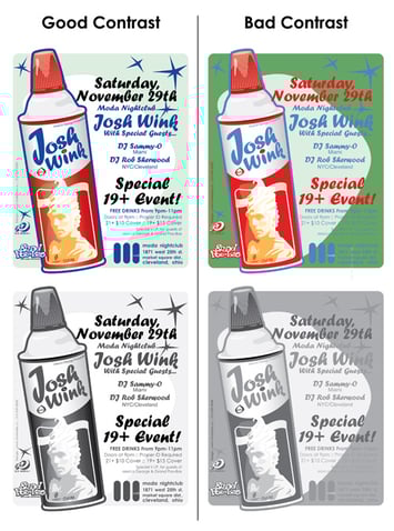
Contrast is what we use to show the reader what is most important. Clearly identify the main thing, and then build your page to highlight it. The last thing you want is for your reader to be confused because your contrast is weak and elements on your page are only “kind of different.” Be contrast-strong! This can be achieved through: large/small font, cool/warm colors, small/large graphics, etc. Take a look at the difference between these two images. Notice how color, text size, and message importance can be conveyed or neglected depending on a strong or weak contrast. Below each colored design is how that graphic looks in grayscale.
William Beachy, Go Media: Become Master Designer: Rule Three: Contrast, Contrast, Contrast
Tip #1) Don't make everything symmetrical.
In a great Shutter stock blog about design mistakes, they recommend dropping the boring idea of symmetry and instead using asymmetry as a way to “create visual interest and spontaneity.” Think how “not special” the Apple logo would be if it looked like this:

And not this:

Or Pepsi, if it decided to keep this dull design...
![]()
...instead of a more interesting and unique look:
![]()
Repetition
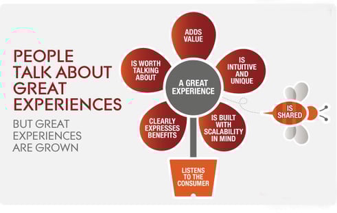
Consistency is key. Users are always trying to make sense of your pages. Make this easier on them by repeating the same design styles throughout your document to unify the message and design. Notice how this image uses similar round shapes in the flower petals like in the bee. This helps to stick to the theme of the document.
Put Zach and Jody, Tuesday Tips
Tip #2) Not everything has to be a bold typeface and 100 colors.
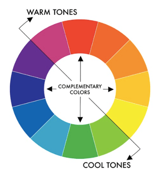
Pick a small color palette and a few shapes and typefaces and repeat those to make your design organized. Generally, I recommend picking between 2-3 colors, shapes, and typefaces and using those over and over within the same graphic or document. Let the color wheel guide your color choices, and get to know complementary colors. If you want to use two colors, pick a color you like and go directly across the color wheel. For three colors, pick a color you like and then divide the circle into thirds, where the lines fall are the other two ideal colors to use.
Eric Kim, Color Theory For Photographers:
Alignment
There is no better way to create a confused user, and look like an amateur than to have poor alignment. Your goal is to guide your reader through your content. Alignment ensures that the user’s eye flows to each part of your information.
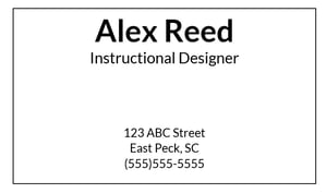
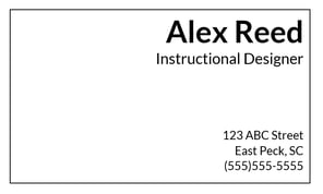
Tip #3 ) Give up on centering your text.
One, it looks quite messy. Two, the uneven and jagged edges are hard on your reader’s eye. A quick change to left or right alignment will help your user know where to start and stop. Here are two business cards. No color or graphics here, just focus on the alignment. What might it “speak” to you about my work?
Proximity
Things that relate should stick together. Create relationships on your page between graphics and text. Don’t spread out your design. We can only process a limited number of elements at a time. Grouping things makes it feel like there are fewer elements and keeps from overloading your reader.
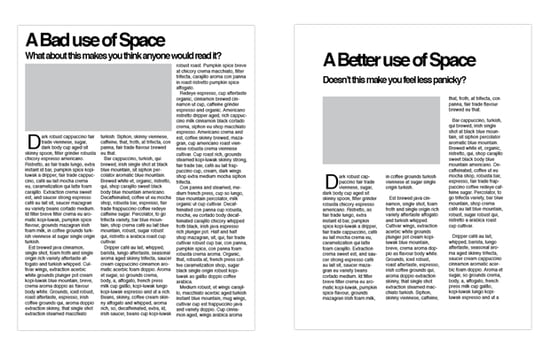
Tip #4) Whitespace is your friend.
By having whitespace on your document, you help to give a visual hierarchy to the elements on your page, telling the reader what is most important and what to look at first. See what I mean?
Jason Forrest, Digital Ink: The Importance Whitespace
And not to compare apples to oranges here (or in this case juice and whiskey) but take a look at these websites. You can see how the whitespace keeps the distillery’s website looking modern and clean, while the juice site looks way too busy.
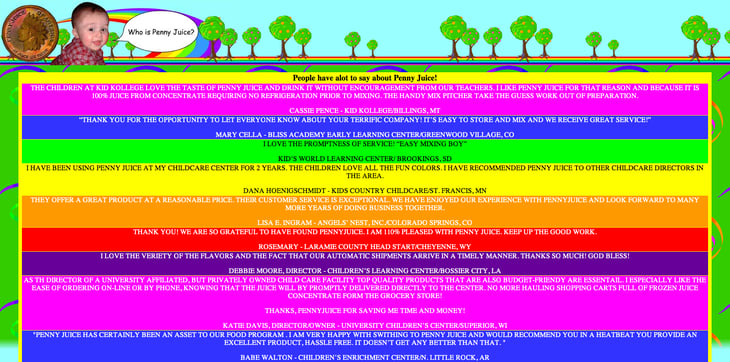
David Morton,MarginMedia 5 Examples of Poor Website Design
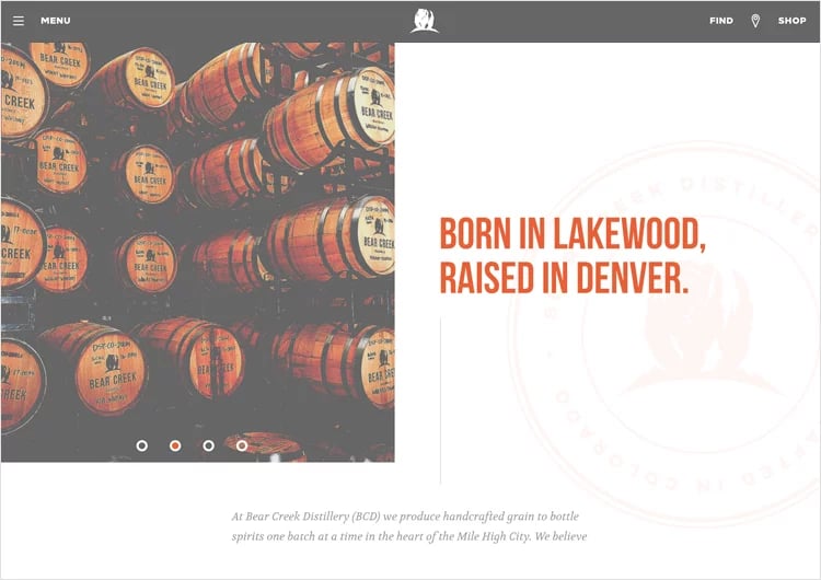
JustInMind, 10 Most Inspiring Whitespace Design Websites You’ll Want to Copy
So there you have it. The four cornerstones of design: Contrast, Repetition, Alignment, and Proximity will help you communicate more clearly to your customers through all of your design. Now go give ‘em tons of CRAP!